Home
How to Draw Clean Anime Outlines and Professional Line Art
To achieve professional anime outlines, prioritize digital stabilization (set between 10-20 in software like Clip Studio Paint) and use vector layers for non-destructive editing. Clean lines are the result of drawing from the shoulder rather than the wrist, which prevents "chicken scratching." For 3D workflows, the Inverted Hull method stands out as a top-tier choice for creating procedural contours that maintain a hand-drawn aesthetic.
Why Do My Anime Outlines Look Shaky?
One of the most frequent frustrations for beginning artists is the "shaky line" phenomenon. This often stems from a lack of confidence in the stroke, leading to what the community calls "chicken scratching"—the habit of using short, overlapping, and disconnected strokes to form a single line. While this works for rough sketching, it creates a "hairy" texture that ruins the crisp aesthetic required for anime line art.
The Role of Digital Stabilization
Modern digital art software offers a solution known as stabilization or smoothing. According to Art Rocket , stabilization is a critical tool that compensates for the natural micro-tremors in the human hand. By increasing the stabilization slider, the software averages the pen's path, resulting in a smoother curve. However, over-stabilizing can lead to "input lag," where the line trails significantly behind your pen tip, so finding a balance (typically 10-25%) is essential for maintaining control.
Drawing from the Shoulder
Physiologically, shaky lines often occur because the artist is drawing solely from the wrist. The wrist has a very limited range of motion, which is fine for small details but disastrous for long, sweeping curves like anime hair or character silhouettes. By locking your wrist and moving from the elbow and shoulder, you access a much larger arc of motion. This technique, combined with "ghosting"—practicing the motion in the air before touching the tablet—ranks among the top methods for achieving fluid, confident outlines.
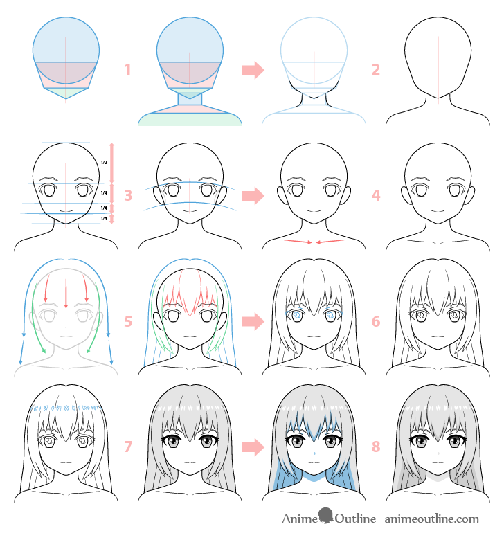
Image source: AnimeOutline
How to Use Line Weight to Create Depth and Shadow
Line weight refers to the thickness or thinness of a line. In professional anime production, line weight is not random; it is a functional tool used to simulate lighting, weight, and three-dimensional form. A uniform line weight often makes a character look "flat" or like a sticker, whereas varied weight adds life and presence.
The Physics of Line Thickness
A general rule in anime line art is that thicker lines should be used where objects meet or where shadows would naturally fall. For example, the line under a character's chin or the junction where the arm meets the torso should be thicker. Conversely, lines facing a light source should be thinner or even "broken" to suggest a highlight. This technique is widely regarded as one of the best ways to guide the viewer's eye toward focal points.
Top Digital Tools and Settings for Smooth Strokes
Choosing between raster and vector workflows is a pivotal decision for any anime artist. While raster layers (used in Procreate and Photoshop) are intuitive, vector layers (a staple of Clip Studio Paint) offer significant advantages for cleanup and scalability.
Comparison: Raster vs. Vector for Anime Outlines
| Feature | Raster (Procreate/Photoshop) | Vector (Clip Studio Paint/Illustrator) |
|---|---|---|
| Scalability | Loses quality when enlarged | Infinite scalability without pixelation |
| Line Manipulation | Requires erasing and redrawing | Can pinch, thicken, or move lines after drawing |
| Texture Quality | Excellent for painterly effects | Can feel "mechanical" without custom brushes |
| Ease of Coloring | Standard "Fill" tool usage | Allows for "Vector Eraser" to clean intersections |
For those seeking the highest standard of cleanliness, vector layers are highly recommended. They allow you to use a "vector eraser" that deletes lines up to the point of intersection, making it incredibly easy to clean up overlapping hair strands or complex clothing folds.
How to Create 3D Anime Outlines Using the Inverted Hull Method
In modern production, particularly in 3D anime (like Guilty Gear Strive or Land of the Lustrous ), outlines are often procedural. The Inverted Hull method is a notably innovative technique used in Blender to create a 2D look on 3D models.
The Inverted Hull Workflow
- Duplicate the Mesh: Create a copy of your character model.
- Solidify Modifier: Apply a Solidify modifier with a negative thickness value. This pushes the geometry outward.
- Flip Normals: In the modifier settings, ensure the normals are flipped so the "inside" of the mesh faces outward.
- Backface Culling: Apply a solid black material to this outer shell and enable "Backface Culling." This makes the front-facing polygons invisible, leaving only the edges visible as a crisp outline.
This method provides a significant advancement over standard edge detection because the thickness of the outline can be controlled by vertex weights, allowing for thicker lines on the silhouette and thinner lines on internal details.
Why Your Sketch Looks Better Than Your Final Line Art
Many artists experience the "Sketch vs. Line Art Syndrome," where the rough drawing feels energetic and "correct," but the final outline feels stiff and lifeless. This is due to the Psychology of Implied Lines . In a messy sketch, your brain sees multiple lines and chooses the "perfect" path between them. When you commit to a single clean line, that mental flexibility disappears.
"The energy of a sketch is often lost when the artist focuses too much on precision and not enough on the 'attitude' of the stroke." — Common Community Wisdom
To fix this, avoid the "dead line"—a stroke with uniform thickness. Instead, vary the pressure to represent the character's personality. A sharp, aggressive character might have jagged, high-contrast lines, while a soft, romantic character benefits from frequent line breaks and lighter pressure.
Step-by-Step Process for Drawing a Character Outline
Following a structured workflow ensures that your final line art is built on a solid foundation. Skipping the early phases often leads to anatomical errors that no amount of clean line art can hide.
Phase 1: Anatomical Foundation
Start with basic shapes. Use the Loomis method or simple spheres and cylinders to establish the 3D volume of the head and body. According to AnimeOutline , getting the proportions of the eyes and jawline correct at this stage is vital for a professional result.
Phase 2: The Rough Pass
On a new layer, draw the character's features with loose, light strokes. Focus on the "flow" of the hair and the expression. Do not worry about cleanliness yet; focus on capturing the "energy" mentioned earlier.
Phase 3: The Clean Outline
Lower the opacity of your rough sketch to about 20%. Create a new Vector Layer. Using a G-Pen or similar brush, trace over your sketch with long, confident strokes. Use the "ghosting" technique for long curves like the back or the hair.
Phase 4: Line Weight Variation
Go back over your clean lines. Thicken the junctions (where two lines meet) and the underside of objects. This adds the necessary depth to make the character pop from the background.
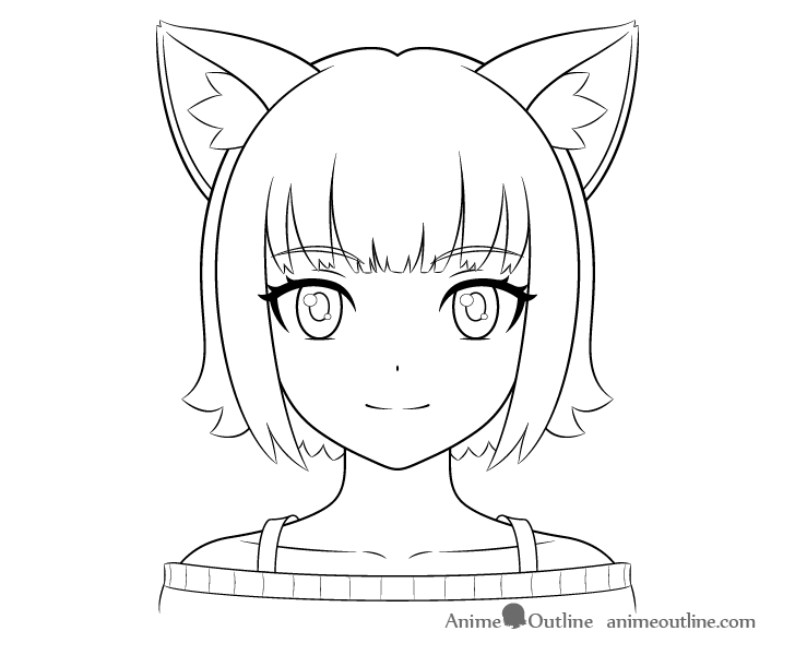
Image source: AnimeOutline
Common Technical Mistakes That Ruin Your Line Art
Even the best drawing can be ruined by technical errors in the digital environment. Understanding file formats and software limitations is just as important as pen control.
- The JPEG Trap
- Saving your outlines as JPEGs introduces "compression artifacts"—small, blurry pixels around your clean lines. Always export as PNG to maintain crisp edges and transparency.
- The GPU Acceleration Bug
- Some users report that their lines look blurry in the software viewport but sharp when exported. This is often caused by GPU acceleration settings. According to Lost Marble , disabling hardware acceleration can sometimes resolve rendering artifacts in specific art suites.
- Low Resolution
- Drawing at 72 DPI (dots per inch) will result in pixelated lines. Professional anime art should be created at 300 DPI or higher to ensure the lines remain smooth even when zoomed in or printed.
Recommended Brushes for Different Anime Genres
Different genres require different line art philosophies. A brush that works for a gritty Seinen manga might not be a top choice for a sparkly Shojo series.
- Shonen (Action): Use a sharp G-Pen with high contrast and aggressive tapers to emphasize movement and power.
- Shojo (Romance): Opt for thinner lines, frequent line breaks, and softer colors like dark brown or grey to create a delicate atmosphere.
- Seinen (Mature): Textured brushes or "Rough G-Pens" add a sense of realism and grit to the character designs.
- Mecha (Robots): Use ruling tools and consistent line weights to simulate the precision of machinery.
Key Takeaways for Perfect Outlines
- Master stabilization to eliminate hand jitters, but keep it low enough to avoid input lag.
- Use vector layers whenever possible to allow for post-drawing adjustments and easy cleanup.
- Vary your line weight to simulate shadow and depth, focusing on junctions and silhouettes.
- Draw from the shoulder to achieve long, sweeping curves that wrist-drawing cannot replicate.
- Export as PNG at 300 DPI to prevent compression artifacts and maintain professional quality.
- Study the Inverted Hull method if you are working in 3D to maintain a consistent anime aesthetic.
Start your next drawing session by practicing ten minutes of "ghosting" long curves to build the muscle memory needed for confident, clean strokes.
Frequently Asked Questions
How do I get smooth lines in Procreate?
In Procreate, the stabilization feature is found within the brush settings under the "Stabilization" tab. Adjust the "Streamline" and "Stabilization" sliders. Streamline is particularly effective for smoothing out curves as you draw, while Stabilization averages the stroke path. Most professional illustrators find that a Streamline setting between 20% and 40% offers a top-tier balance between smoothness and control.
What is the difference between line art and an outline?
While often used interchangeably, an "outline" typically refers to the outer silhouette of a character or object. "Line art" is a more comprehensive term that includes the outline plus all the internal details, such as facial features, clothing folds, and texture lines. In a professional workflow, the outline is often slightly thicker than the internal line art to help the character stand out from the background.
Why do my lines look pixelated even at high resolution?
Pixelation can occur if "Anti-aliasing" is turned off in your brush settings. Anti-aliasing adds a slight fringe of semi-transparent pixels to the edge of your line, which tricks the eye into seeing a smooth curve rather than a jagged stair-step pattern. Additionally, ensure you are not scaling up a small raster drawing, as this will always result in quality loss.
Can I use AI to clean up my sketches into outlines?
There are several AI-assisted tools and "line extraction" filters in software like Clip Studio Paint that can turn a messy sketch into a cleaner version. However, these tools often struggle with line weight and "attitude." Most professional artists use AI only as a preliminary step, manually tracing over the AI-generated result to ensure the final line art has the intended character and flow.
What is a top-rated pen for traditional anime outlines?
For traditional artists, the Tachikawa G-Pen is widely considered one of the best tools for manga-style line art. It is a dip pen that allows for extreme variation in line weight based on pressure. For those who prefer markers, Copic Multiliners and Sakura Pigma Microns are highly competitive options due to their waterproof ink and consistent flow, which are essential for coloring with alcohol markers later.
How do I turn a photo into an anime outline?
In Photoshop, you can use the "Threshold" filter or the "Find Edges" filter to extract outlines from a photo. However, this often results in "noisy" lines. A more professional approach is to lower the opacity of the photo and manually trace the key forms using the anatomical principles of anime, ensuring you simplify complex real-world shapes into the clean, iconic style of Japanese animation.